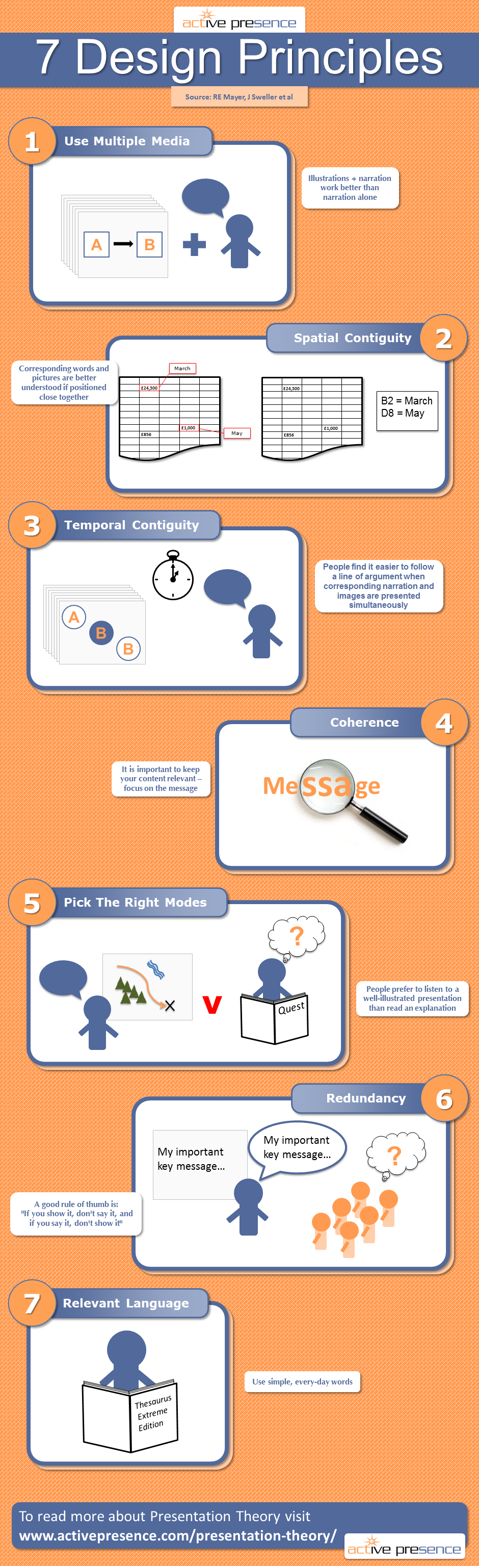
INFOGRAPHIC: Seven Design Principles
These seven principles come from excellent research conducted by RE Mayer, J Sweller et al. Use them as a guide for your documents and presentations, and you won't go far wrong.
- Use multiple media
With particular respect to presentations, illustrations plus narration work better than narration alone. Use pictures to illustrate what you are saying. The audience will find it easier to follow and will remember more. - Spatial contiguity
Words and pictures that correspond are better understood if positioned close together. Relevant if you're designing a printed document (like a set of accounts, for example). Keep the numbers and the associated explanations in easy view of each other. - Temporal contiguity
People find it easier to follow a line of argument when corresponding words and images are presented simultaneously. When delivering a presentation, ensure your narration is delivered in sync with associated graphics. - Coherence
It is important to keep your content relevant. Focus on the message. Delete extraneous words, images or sounds, they only confuse and distract. - Pick the right modes
Generally speaking audiences favour narrated & illustrated performances over illustrated textural explanations. Put simply, people prefer to listen to a well-illustrated presentation than read an explanation – even if both use similar illustrations. - Redundancy
Repeating words written on slides risks over-loading working memory (with the result that your message isn't remembered). The rule of thumb is, "If you show it, don't say it, and if you say it, don't show it". - Relevant language
Use simple, every-day words. Resist the temptation to slide into 'corporate speak' just because you're delivering a presentation or writing a document. Support the Plain English Campaign.